Text Flow Basic テキストが横方向に流れる基本アニメーション
Gradient text scrolls horizontally in an infinite loop with speed controlled via a custom property. グラデーションテキストを無限ループで横方向に流し、スピードをカスタムプロパティで制御します。
View Detailsバイブコーディング向けに最適化された、軽量なアニメーション&UIリファレンス。 URLやプロンプトをAIに渡すだけで、正確なコードを即座に生成できます。 Curated UI patterns & CSS animations optimized for AI vibe coding. Drop any snippet URL into your AI prompt for instant, production-ready code.
Gradient text scrolls horizontally in an infinite loop with speed controlled via a custom property. グラデーションテキストを無限ループで横方向に流し、スピードをカスタムプロパティで制御します。
View DetailsA gradient CTA button breathes with a neon glow whose intensity and speed are adjustable via custom properties. グラデーションCTAが呼吸するように発光し、強度やスピードをカスタムプロパティで調整できます。
View DetailsElements fade in while scaling up for entrance animations with staggered delays. 要素がフェードインしながらスケールアップして表示されるエントランスアニメーション。
View DetailsCards lift up on hover with expanded shadows. Adjust lift height and shadow intensity. ホバー時にカードが浮き上がり影が拡大するエフェクト。リフト高さと影の強度を調整できます。
View DetailsBeautiful animation where text slides up word by word from below. Customize reveal speed and word delay. テキストが単語ごとに下からスライドして表示される美しいアニメーション。表示速度と間隔を調整できます。
View DetailsFloating particles in the background. Customize particle count, speed, and colors. 背景に浮遊するパーティクルアニメーション。粒子の数、速度、色をカスタマイズできます。
View DetailsLink with underline that grows from the center on hover. Hover.css-style pattern. ホバー時に下線が中央から左右に伸びるリンクスタイル。Hover.css 系のパターン。
View DetailsShake on error and bounce on success. Animista-style keyframe feedback. エラー時シェイク・成功時バウンスのフィードバックアニメーション。Animista 系のキーフレームパターン。
View DetailsIcon rotates on hover. Hover.css-style pattern. ホバー時にアイコンが回転するエフェクト。Hover.css 系のパターン。
View DetailsEffect where text appears one character at a time like a typewriter. テキストが一文字ずつタイプされるように表示されるエフェクト。
View DetailsAnimation that counts up from zero to a specified number. 指定した数値までゼロからカウントアップするアニメーション。
View DetailsFade-in effect for elements as they scroll into the viewport. スクロールして画面内に入った要素をフェードインさせるエフェクト。
View DetailsA rotating conic-gradient glow wraps a glassy card with adjustable bloom spread and speed. conic-gradient の虹色グローがカード外周を回転し、発光の広がりと速度を調整できる演出。
View DetailsA WebGL hero background using ridged simplex noise to render deep-green to cyan beams, with mouse-driven drift. Simplexノイズのリッジ発光で、深緑→シアンのビームが流れるWebGL背景。マウスで揺らぎを操作。
View DetailsFive blurred radial-gradient orbs float on CSS keyframes, blending into a vivid mesh — a WebGL-free hero background. 5つのぼかしオーブが CSS keyframes で浮遊し、WebGLなしで生成感のあるメッシュグラデーション背景を実現。
View DetailsSimulate a water surface on a 2D canvas and refract a hero background through it, with ripples following the pointer. Canvas 2D 上で水面をシミュレートし、ヒーロー背景を屈折させます。ポインタの動きに合わせて波紋が広がります。
View DetailsTurn a section boundary into a moving water line with layered SVG waves that react to the pointer. 重ねた SVG の波でセクションの境目を動く水面に変え、カーソル操作に反応させます。
View DetailsShow progress, capacity or scores as water rising inside a circle, with a surface that reacts to clicks. 進捗・容量・スコアを円の中で満ちる水として表示し、クリックにも反応します。
View DetailsA caustics light-net hero background that looks like sunlight rippling on a pool floor, computed on a tiny canvas and stretched with CSS. プールの底で揺れる日差しのような光の網目を、小さなCanvasで計算してCSSで引き伸ばすヒーロー背景です。
View DetailsHeader reading progress bar synced with active section tracking and scroll completion percentage. スクロール量と現在閲覧中のセクションをヘッダーバーと連動させるアクセシブルな読了進行インジケーター。
View DetailsCards pivot upright with tactile 3D perspective transforms upon scrolling into viewport. CSS 3Dパースペクティブとtransform-originを活用した触感豊かなスクロールイン演出。
View DetailsWords illuminate progressively line by line in response to scroll progression. ユーザーのスクロールリズムに合わせて単語が次々と光を帯びて浮かび上がる読書体験向上演出。
View DetailsMulti-layered shimmering aurora ribbons with additive color blending and cursor drift. 加算合成と複合正弦波によるエメラルド&シアンのオーロラ光幕とマウスインタラクション演出。
View Details3D perspective warp-speed celestial streaks with interactive cursor steering and hyperspeed click boost. 三次元透視投影によるリアルタイム星屑ストリークと、コックピット視点の操舵インタラクション。
View DetailsProximity-linked node graph with pointer gravity and distance-attenuated radiance. ノード間の距離減衰接続ラインとポインター引力による、王道のテック系インタラクティブネットワーク背景。
View DetailsA rainy-window hero background: beads merge, heavy drops run down and clear a streak, and each drop refracts an in-focus, upside-down copy of the blurred city behind it. 雨の窓を再現するヒーロー背景です。水滴が合体し、重くなった雨粒が筋を残して流れ、雨粒の中には背景の街明かりがピントの合った逆さまの姿で映ります。
View DetailsHigh-energy motion poster featuring alternating angled marquee banners, brutalist color blocks, interactive pause controls, and Swiss modernism aesthetics. 流れるテキストリボンや幾何学ストライプ、一時停止切り替えを備えた動的タイポグラフィポスター。
View DetailsCircular sweeping radar scope simulating target detection blips with pause/resume controls and telemetry list. レーダースイープと静的架空信号データの走査・一時停止UI。
View DetailsShimmering skeleton rows for list-loading states with adjustable speed. リスト読み込み時の骨組み表示をシマーアニメーションで表現するパターン。
View DetailsCSS-only dot wave loader using staggered animation-delay for each dot. Pure CSS, lightweight, highly customizable. 各ドットにanimation-delayをずらすだけでウェーブ効果を実現するCSS専用ローダー。軽量でカスタマイズ性が高い。
View DetailsRotating spinner loader. Adjust rotation speed and size via custom properties. 回転するスピナーローダー。回転速度とサイズをカスタムプロパティで調整できます。
View DetailsProgress bar displaying loading progress. Customize animation speed and colors. 進捗を表示するプログレスバー。アニメーション速度と色をカスタマイズできます。
View DetailsCard-style skeleton loading placeholder. Displays loading state with shimmer animation. カード形式のスケルトンローディング。シマーアニメーションで読み込み状態を表現します。
View DetailsSlide-in notification from the edge. Adjust display duration and animation speed. 画面端からスライドインする一時通知。表示時間とアニメーション速度を調整できます。
View DetailsFullscreen loading overlay with fade. Spinner and message. 画面全体を覆うローディングオーバーレイ。フェード表示。
View DetailsEmpty state UI with illustration and description for zero-data cases. データがない場合に表示するイラスト付きのエンプティステート。
View DetailsAnimated checkmark drawn to indicate successful completion. 完了時に描画されるアニメーションチェックマーク。
View DetailsEach letter glows and fades in one by one as a chromatic scan sweeps behind — perfect for AI generation states. 文字が1つずつグロー発光しながらフェードインし、クロマティックな光のスキャンが背後を走るAI生成風ローダー。
View DetailsSatellite dots smoothly orbiting around a central core using pure CSS transforms. CSSトランスフォームを用いた中央コア周囲の衛星ドット周回ローダー。
View DetailsStaggered scaleY vertical bars creating a smooth wave loading indicator. 時間差の垂直スケール変化による5本バーのウェーブローダー。
View DetailsExpanding fading concentric rings producing an organic sonar ripple. 波紋のように外側へ広がり消える3重リングのローダー。
View DetailsFour tiles in a 2x2 grid rotating with staggered 3D flips and subtle perspective. 2x2タイルの3Dフリップによるモダンで立体的なローディング演出。
View DetailsRecognizable CSS-only hourglass with sand drainage, stream, and full rotation. 砂の流下と180度反転をCSSのみで表現した砂時計ローダー。
View DetailsCascading concentric pulse wave across a 3x3 dot matrix. 3x3ドットマトリクスを伝播する美しい同心円パルスウェーブ演出。
View DetailsSmooth geometric shape-shifting loader with dynamic gradient rotation. CSSのborder-radiusとグラデーション遷移による美しい幾何学形状モーフィングローダー。
View DetailsLuminous glow stroke racing along an infinite SVG bezier curve. SVGの無限大パス上を周回するネオングロー光線のアニメーション演出。
View DetailsDual counter-rotating neon glow rings with pulsating energy core. 二重同心リングの逆回転とネオングローによるフューチャリスティックなローディング演出。
View DetailsTranslucent capsule with organic rising and popping liquid bubbles. 微細な気泡の浮上と弾けるアニメーションによる親しみやすい液体ローダー。
View DetailsLayered card notification inbox with dynamic read toggles, real-time unread counter, and status indicators. 3件の通知の既読トグルとリアルタイムな未読カウント管理UI。
View DetailsA minimal tab navigation where the underline indicator glides to the active item. アクティブタブに合わせて下線インジケーターが滑らかに移動するシンプルなタブナビゲーション。
View DetailsA multi-step progress component using dots and a connecting line that animates to the active step. 複数ステップの進捗をドットとラインで可視化し、アクティブインジケーターが滑らかに切り替わるステッパーUI。
View DetailsDropdown menus that expand on click or hover with adjustable animation speed and direction. クリックまたはホバーで展開するドロップダウンメニュー。アニメーション速度と方向を調整できます。
View DetailsBreadcrumb navigation showing hierarchical structure. Customize separators and hover effects. 階層構造を表示するパンくずリストナビゲーション。セパレーターとホバーエフェクトをカスタマイズできます。
View DetailsPagination component displaying page numbers. Customize active page highlight and hover effects. ページ番号を表示するページネーションコンポーネント。アクティブページのハイライトとホバーエフェクトをカスタマイズできます。
View DetailsButton that appears on scroll and smoothly scrolls back to top on click. スクロール時に表示され、クリックでページトップへスムーズに戻るボタン。
View DetailsFloating action button at corner. Scale on hover. 画面隅に浮かぶアクションボタン。ホバーで拡大。
View DetailsCollapsible sidebar navigation suitable for admin dashboards. 折りたたみ可能なサイドバーナビゲーション。
View DetailsMobile-friendly fullscreen menu with animated toggle icon. モバイル向けフルスクリーンメニューとアニメーションアイコン。
View DetailsKeyboard-first command palette that opens with Ctrl or Cmd + K and filters actions in a modal list. Ctrl / Cmd + K で開き、モーダル内のアクションを絞り込めるキーボード優先のコマンドパレット。
View DetailsA floating radial utility menu that fans out around a central trigger with spring-inspired transforms, SVG iconography, Escape key closure, and ARIA state handling. フローティングボタンから扇状に展開する円形ツールドック。Escapeキー閉鎖やARIA属性に対応。
View DetailsCosmic themed multi-stage progress tracker with planetary orbital nodes, progression controls, and full reset action. 宇宙軌道風デザインの3段階進行ステップとリセット操作。
View DetailsModal that fades in and scales up. Adjust animation speed and direction. フェードインとスケールで表示されるモーダル。アニメーション速度と方向を調整できます。
View DetailsRipple effect that expands from click position. Adjust ripple size and speed. ボタンクリック時に波紋が広がるリップルエフェクト。波紋のサイズと速度を調整できます。
View Details3D card flip animation on click or hover. Adjust rotation axis and speed. カードをクリックまたはホバーで裏返すフリップアニメーション。回転軸と速度を調整できます。
View DetailsTooltip that appears on hover. Customize position, animation, and styling. ホバー時に表示されるツールチップ。位置、アニメーション、スタイルをカスタマイズできます。
View DetailsAccordion that expands and collapses on click. Customize animation speed and styling. クリックで展開/折りたたみができるアコーディオン。アニメーション速度とスタイルをカスタマイズできます。
View DetailsON/OFF toggle switch. collect UI-style pattern. ON/OFF を切り替えるトグルスイッチ。collect UI 系のパターン。
View DetailsSortable list interface using drag and drop interactions. 項目の並べ替えが可能なドラッグ&ドロップリスト。
View DetailsBasic image slider with manual navigation controls. スワイプやボタンで画像を切り替える基本的なスライダー。
View DetailsButton that copies text to clipboard and shows feedback. クリックでテキストをコピーし、フィードバックを表示するボタン。
View DetailsGDPR-style cookie consent banner that slides in from the bottom on first visit with Accept/Decline actions. 初回訪問時にスライドインするGDPRスタイルのCookieコンセントバナー。Accept/Declineの操作で非表示に。
View DetailsReveals the next batch of items with a fade-slide-up animation. Shows remaining count and a loading spinner. クリックで次バッチをフェードインで追加表示するロードモアボタン。残件数表示とスピナー付き。
View DetailsAn interactive airline boarding pass with dynamic iridescent shimmer, 3D tilt tracking, tear-off perforation styling, and inline SVG security watermark. ポインタ追従による虹色光沢シマーと3Dチルト効果、ミシン目切り離し風の搭乗券UIデモ。
View DetailsArchitectural cybernetic product blueprint rendered purely with CSS and SVG vectors, featuring dimension lines, coordinates, and pulsing interactive inspection nodes. 外部画像なしのCSSとSVGだけで緻密に描いた製品設計図。寸法線やパルス点滅するホットスポットを備える。
View DetailsRealistic concert ticket with perforated stub, barcode graphic, and reversible front-to-back flip switch. ミシン目とバーコードを備え、表面と裏面を切り替え可能なチケット。
View DetailsHarmonic color scheme generator showcasing 5 interactive color swatches across 3 curated palette presets. 5色のスウォッチと3種のプリセットでカラーコードを瞬時に確認。
View DetailsMaterial Design-style input where the label floats up on focus. フォーカス時にラベルが上部に移動するマテリアルデザイン風の入力フィールド。
View DetailsFully styleable custom select box with animated dropdown options. スタイリング可能なカスタムセレクトボックス。アニメーション付きのドロップダウン。
View DetailsAnimated custom checkboxes and radio buttons. アニメーションするカスタムチェックボックスとラジオボタン。
View DetailsVisual feedback patterns for input success and error states. 入力内容の成功・エラー状態を視覚的にフィードバックするパターン。
View DetailsAutocomplete search box that displays a suggestion list while typing. 入力中に候補リストを表示するオートコンプリート検索ボックス。
View DetailsKeep notes within a character budget without cutting off pasted text or Japanese input. 貼り付けた文章や日本語入力を切り捨てず、文字数の目安と超過状態を確認できます。
View DetailsChoose a quantity with buttons, direct input, or native arrow keys, with clear feedback at every boundary. ボタン・直接入力・上下キーで数量を選択し、上下限や入力エラーを確認できます。
View DetailsValidate on submit, focus a concise error summary, and keep every message connected to its field. 送信時に検証し、エラーサマリーへフォーカスを移動。各メッセージを入力項目と関連付けます。
View DetailsAccept files by drag-and-drop or click, validate type and size, and animate a per-file upload progress bar. ドラッグ&ドロップまたはクリックでファイルを受け付け、種類とサイズを検証してファイルごとの進捗バーを表示します。
View DetailsA keyboard-accessible star rating input filled entirely with the CSS general sibling selector, no JavaScript required for the visual state. JavaScriptなしでCSSの一般兄弟セレクタだけで塗りつぶす、キーボード操作可能な星評価入力。
View DetailsSubscription tier selector with a mechanical rotary dial gauge, dynamic pricing update, and detailed feature breakdown. 装飾回転ダイヤルと連動して価格とプラン内容が切り替わるUI。
View DetailsA split hero layout that separates copy and preview panels with a customizable column ratio. コピーとプレビューを左右に分けるヒーローレイアウト。カラム比率をカスタムプロパティで柔軟に変更できます。
View DetailsStacked cards that float on hover with offsets controlled by a custom property. ずらしたカードを重ねてホバー時に浮かせるレイアウト。カスタムプロパティでオフセット量を調整できます。
View DetailsBackground moves slower than foreground on scroll, creating depth. Adjust speed ratio. スクロールに応じて背景と前景が異なる速度で動くパララックス効果。速度比を調整できます。
View DetailsMasonry layout for cards with varying heights. Implemented using CSS Grid with customizable columns and gap. 不均等な高さのカードを配置するマーソンリーレイアウト。CSS Gridを使用して実装し、カラム数とギャップをカスタマイズできます。
View DetailsSticky header that remains fixed at the top when scrolling. Customize background opacity and shadow. スクロール時に画面上部に固定表示されるスティッキーヘッダー。背景の透明度と影をカスタマイズできます。
View DetailsResponsive footer with multi-column links and copyright notice. マルチカラムのリンクと著作権表示を含むレスポンシブフッター。
View DetailsGrid of pricing cards for plan comparison, with highlighted recommended plan. プラン比較のための料金カードグリッド。推奨プランの強調表示付き。
View DetailsCTA section with distinct background and action button. 目立つ背景とアクションボタンを持つCTA(Call To Action)セクション。
View DetailsCompare multiple plans or products row by row in a table that scrolls horizontally on mobile instead of breaking. 複数のプランや製品を項目ごとに比較する表。モバイルではレイアウト崩れの代わりに横スクロールします。
View DetailsHigh-contrast editorial typography panels that expand upon interaction with fluid CSS sizing, full keyboard navigation, and zero image dependencies. 写真を使わずに大胆なタイポグラフィとキーボード対応アコーディオンで魅せるエディトリアル展開パネル。
View DetailsMagazine typography layout with geometric cards and instant category filtering between Design, Art, and All views. 雑誌風タイポグラフィと幾何学カードのカテゴリ別表示切替UI。
View DetailsA video thumbnail that reveals play controls and metadata on hover. サムネイルにホバーするとプレイボタンとメタ情報が浮き上がる動画プレビューカード。
View DetailsA fixed mini video player dock with thumbnail, metadata, and progress bar. 画面下に固定したミニ動画プレーヤー。サムネイルと進捗バーを1列にまとめたUI。
View DetailsGrid layout image gallery. Images scale up on hover with overlay reveal. グリッドレイアウトの画像ギャラリー。ホバー時に拡大表示やオーバーレイを表示できます。
View DetailsImage zooms in smoothly on hover. Codrops-style media hover pattern. ホバー時に画像がゆっくりズームするエフェクト。Codrops 系のメディアホバーパターン。
View DetailsInteractive slider to compare two overlapping images. スライダーを動かして2枚の画像を比較できるUI。
View DetailsAudio player UI featuring a simulated waveform visualizer. 波形ビジュアライザー風の演出を含むオーディオプレーヤーUI。
View DetailsCSS Scroll Snap carousel meeting a11y requirements via inert, prefers-reduced-motion, and aria-live announcements. inert 属性・prefers-reduced-motion・aria-live でアクセシビリティ要件を満たした CSS Scroll Snap カルーセル。
View DetailsInteractive vinyl turntable visual simulation featuring spinning vinyl, tonearm tracking, and playback toggle controls. レコード盤の回転とアームを操作する視覚シミュレータ。(音声なし)
View DetailsCSS gradient landscape frames with film perforation aesthetic, interactive carousel navigation, and frame counters. 風景風グラデーションのフィルムコマ送りUIと現在位置表示。
View DetailsSwitches gradients and icons between day and night based on local time or manual toggles. 時間帯に応じて背景グラデーションとアイコンを切り替えるテーマ演出。
View DetailsCycles mood-based gradients with buttons and a hue-rotate animation. ボタンでムード別グラデーションを切り替え、CSSアニメーションで色相を循環させるテーマ演出。
View DetailsTheme system that switches color palettes with buttons. Choose from multiple presets. ボタンでカラーパレットを切り替えるテーマシステム。複数のプリセットから選択できます。
View DetailsToggle light/dark theme. Smooth transition with CSS variables. ライト/ダークテーマを切り替えるトグル。CSS変数で滑らかに遷移。
View DetailsGlowing neon styled billing cycle switch with annual discount indicators and instant tier price updates. 月額と年額の切り替えで割引価格とバッジが更新されるネオンUI。
View Details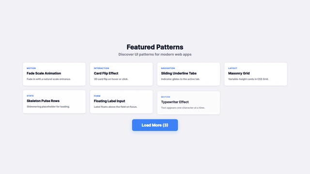
Remotion video template auto-playing: button press → loading → card batch → highlight. 1920×1080 / 30fps / 7s. ボタン押下→ローディング→カード追加→ハイライトを自動再生する Remotion 動画テンプレ。1920×1080 / 30fps / 7秒。
View Details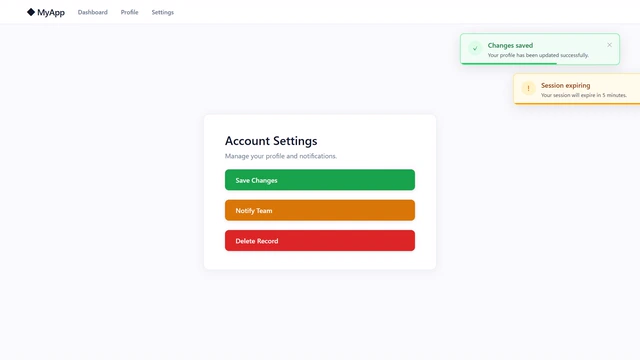
Remotion video template: Success / Warning / Error toasts stack in sequence and auto-dismiss. 1920×1080 / 30fps / 8s. Success / Warning / Error の3種トーストが順番にスタックし自動消去される Remotion 動画テンプレ。1920×1080 / 30fps / 8秒。
View Details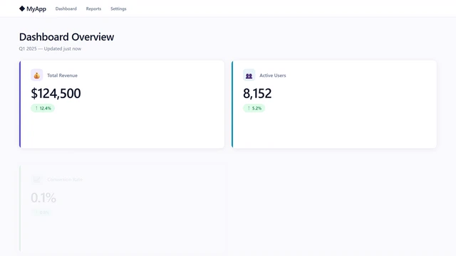
Remotion video template: 4 KPI stat cards reveal in staggered sequence with count-up number animations. 1920×1080 / 30fps / 10s. 4枚のKPIカードがスタガーで登場しながら数値がカウントアップするダッシュボード紹介シーンの Remotion 動画テンプレ。1920×1080 / 30fps / 10秒。
View Details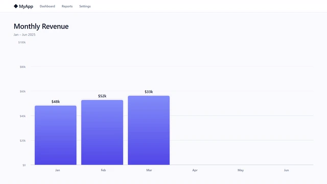
Remotion video template: monthly revenue bars grow upward one by one with count-up numbers. Violet accent highlights the peak bar. 1920×1080 / 30fps / 10s. 月次売上の棒グラフが左から1本ずつ伸び上がりながら数値がカウントアップするチャートリビールシーンの Remotion 動画テンプレ。1920×1080 / 30fps / 10秒。
View Details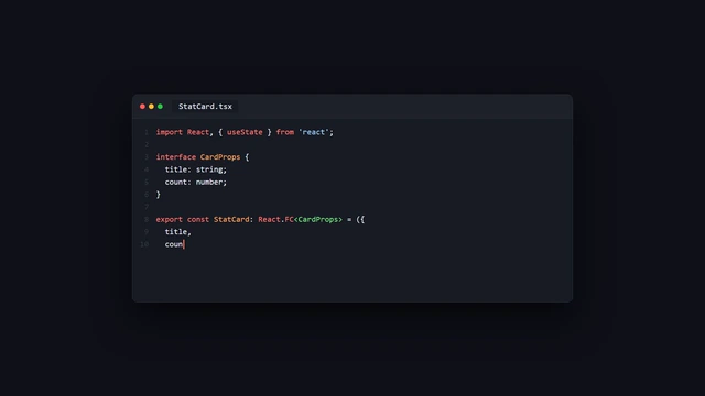
Remotion video template: code types out character by character in a VS Code-style editor with syntax highlighting and a blinking cursor. 1920×1080 / 30fps / 12s. コードが1文字ずつタイプされながら現れるコードエディター風シーンの Remotion 動画テンプレ。シンタックスハイライト・ブリンクカーソル付き。1920×1080 / 30fps / 12秒。
View Detailsライブプレビューを見ながら、作りたいUIやアニメーションを探します。 Browse live previews to find the exact interaction or animation you need.
カード上の「Prompt」ボタンを押すと、AI用の指示文と正規URLが即座にクリップボードにコピーされます。 Click "Prompt" on the card to copy structured context and canonical URL into clipboard.
Claude, ChatGPT, Cursor, GitHub Copilot等に貼り付けるだけで、外部依存のないクリーンなコードが手に入ります。 Paste into your AI coding tool to get clean, dependency-free HTML, CSS, or React code.
/llms.txt および /llms-full.txt を提供しており、AIエージェントがサイト全体のスニペット定義とプロンプト仕様を瞬時に取得できます。また /api/snippets.json の静的JSON APIも利用可能です。
Yes, DevSnips hosts /llms.txt, /llms-full.txt, and static JSON APIs under /api/snippets.json for seamless AI ingestion.